
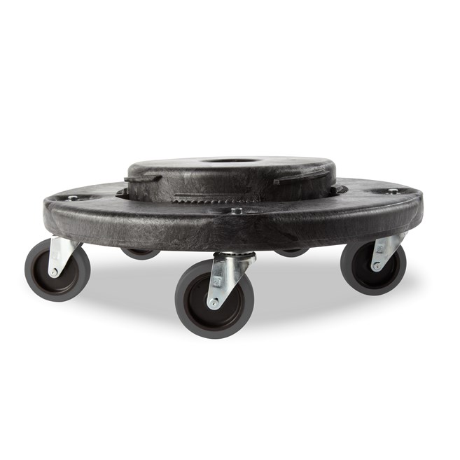
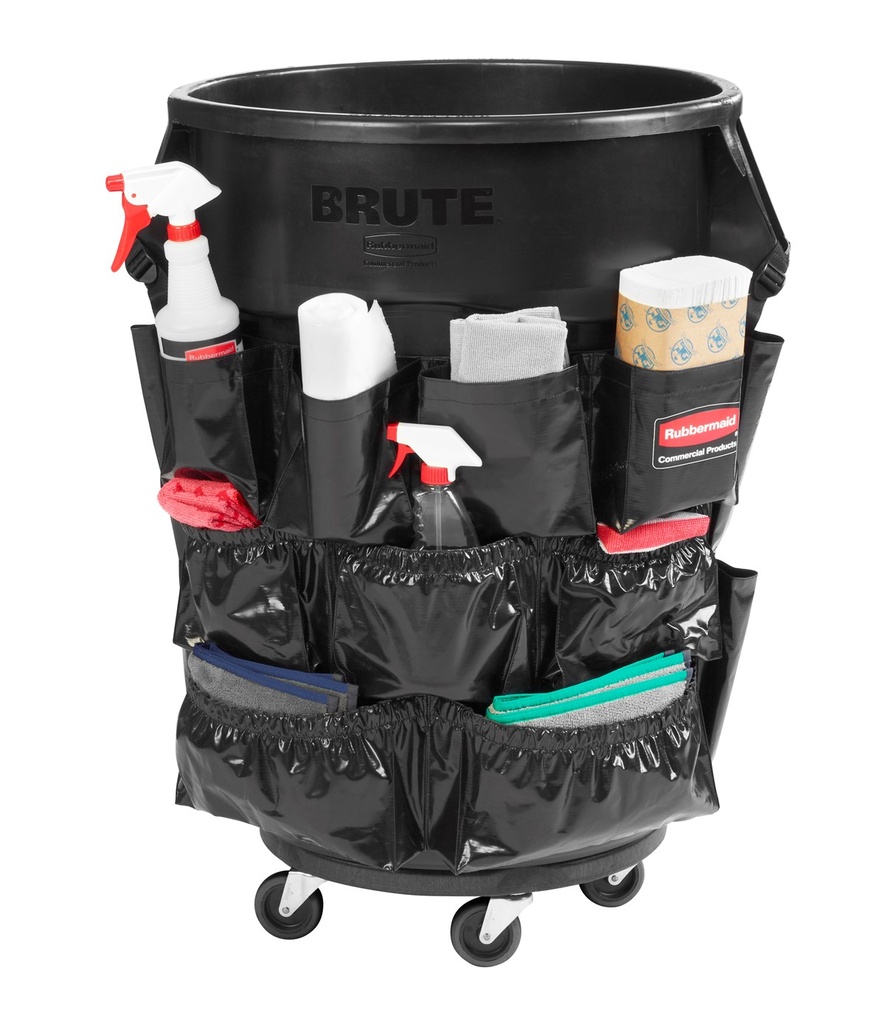
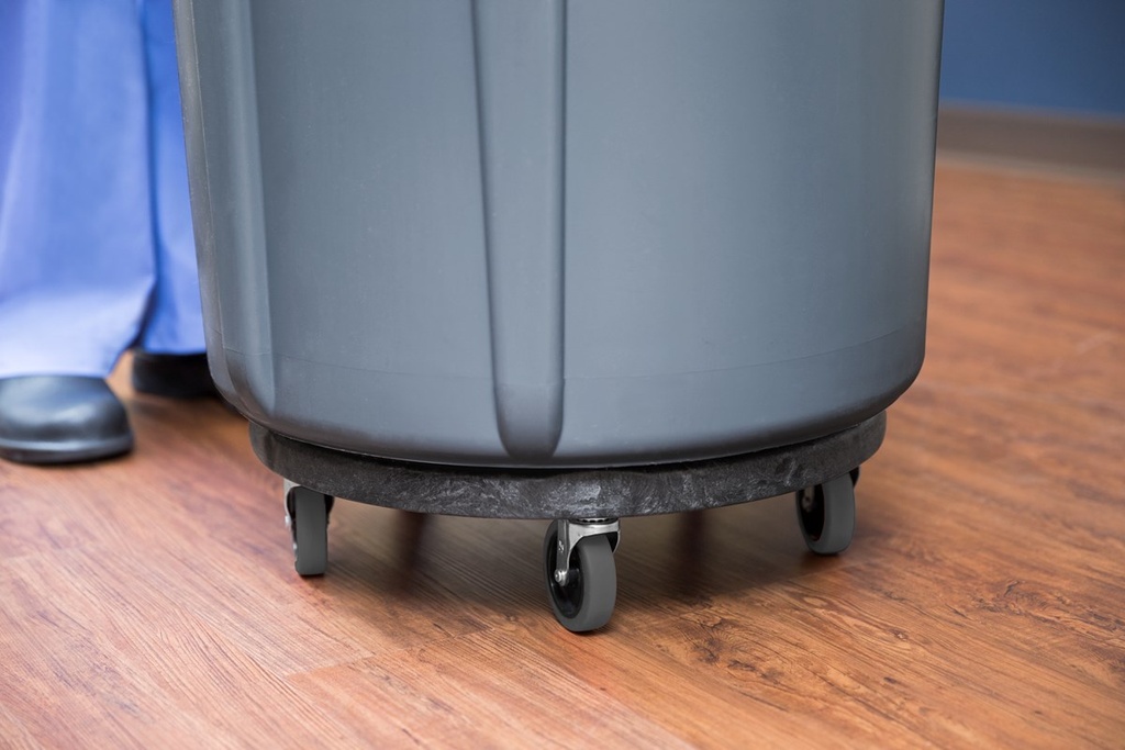
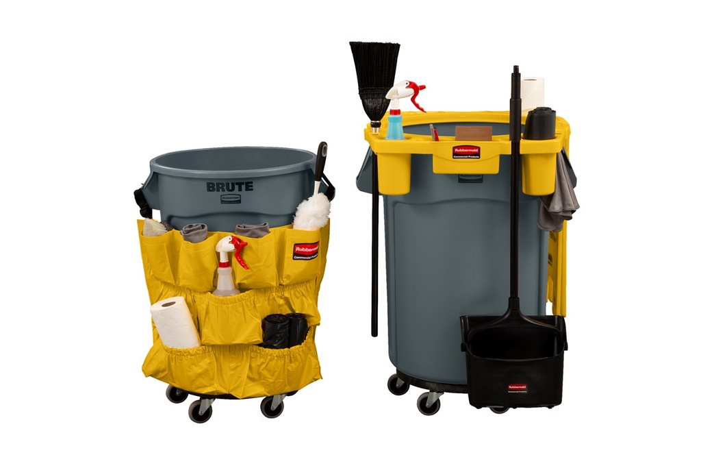
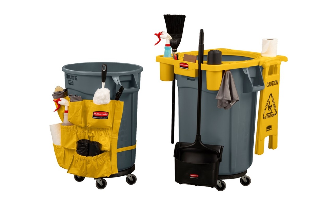

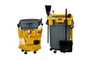

Plataforma con ruedas silenciosas brute® negra
La plataforma con ruedas Rubbermaid commercial BRUTE ofrece fácil movilidad y maniobrabilidad para recoger y transportar cargas pesadas.
Apto para los contenedores BRUTE® de 76 l.
Garantía profesional de 3 a 10 años según la gama Rubbermaid.
Compatibilidad y puntos clave
- Apto para los contenedores BRUTE® de 76 l, 121 l, 167 l, 208 l ruedas giratorias resistentes grises de 7,6 cm que ofrecen una mejor movilidad en la…
- Garantía profesional de 3 a 10 años según la gama Rubbermaid.
FG264043BLA
Black
BRUTE Mobility Accessories
Ventajas en el día a día
- Mejora la estabilidad del contenedor en zonas de paso y ubicaciones exigentes.
- Permite ajustar el lastre según la instalación (arena o agua).
- Reduce el riesgo de vuelco en entornos con tránsito continuo.
Información técnica
| Pedido mínimo / caja | 2 |
| Descripción | Plataforma con ruedas silenciosas BRUTE® negra |
| SU-CODE | FG264043BLA |
| Categoría | Commercial Utility Refuse |
| Familia del producto | Round Utility Containers |
| Línea del producto | BRUTE Mobility Accessories |
| Color | BLACK / negro |
| Largo | 45.8 cm |
| Anchura | 45.8 cm |
| Altura | 16 cm |
| Peso neto | 2.2 kg |
| Volumen | 33.56 dm³ |
| Almacén | Nivel de stock: amplio |
| País de origen | US |
| EAN / UPC | 86876173208 |
| Código arancelario (HS/SA) | 8716800000 |
Garantía profesional de 3 a 10 años según la gama Rubbermaid.
Sin atributos
<!-- Visor híbrido ISSUU (responsive universal) para "Catálogo técnico y comercial de la gama BRUTE" -->
<!-- Copia y pega este bloque tal cual en tu web -->
<style>
.issuu-wrap { max-width: 1600px; margin: 0 auto; padding: 12px; }
.issuu-viewport {
position: relative;
width: 100%;
height: clamp(360px, 100vh, 1200px);
border-radius: 12px;
overflow: hidden;
background: #0b0b0b;
box-shadow: 0 10px 30px rgba(0,0,0,.2);
}
@supports(height:100dvh){ .issuu-viewport{ height: clamp(360px, 100dvh, 1200px);} }
.issuu-viewport iframe{ position:absolute; inset:0; width:100%; height:100%; border:0; }
.issuu-actions{ display:flex; gap:12px; flex-wrap:wrap; margin-top:10px; }
.issuu-actions a, .issuu-actions button{
display:inline-flex; align-items:center; gap:8px; padding:10px 14px; border-radius:10px;
border:1px solid rgba(0,0,0,.12); background:#fff; text-decoration:none;
box-shadow:0 2px 10px rgba(0,0,0,.06); font:500 14px/1.15 system-ui, -apple-system, Segoe UI, Roboto, Helvetica, Arial, sans-serif; cursor:pointer;
}
.issuu-actions a:hover, .issuu-actions button:hover{ box-shadow:0 4px 16px rgba(0,0,0,.12); }
</style>
<div class="issuu-wrap" role="region" aria-label="ISSUU — Catálogo BRUTE (visor responsive)">
<div class="issuu-viewport" id="issuuViewport">
<!-- Enlace proporcionado: https://issuu.com/servitrapo/docs/cat_logo_t_cnico_y_comercial_de_la_gama_brute_de_ -->
<iframe
src="https://e.issuu.com/embed.html?d=cat_logo_t_cnico_y_comercial_de_la_gama_brute_de_&u=servitrapo"
title="Catálogo BRUTE — visor ISSUU"
loading="lazy"
allow="autoplay"
referrerpolicy="no-referrer">
</iframe>
</div>
<div class="issuu-actions">
<a target="_blank" rel="noopener" href="https://issuu.com/servitrapo/docs/cat_logo_t_cnico_y_comercial_de_la_gama_brute_de_?fr=sMmVhOTg4NjE4MTY">Abrir en pestaña</a>
<button type="button" id="btnFull">Pantalla completa</button>
</div>
<div style="margin-top:8px;font:400 13px/1.4 system-ui, -apple-system, Segoe UI, Roboto, Helvetica, Arial, sans-serif;color:#555;">Si el visor no se carga por políticas del navegador, usa “Abrir en pestaña”.</div>
</div>
<script>
// Pantalla completa del contenedor
(function(){
const btn = document.getElementById('btnFull');
const vp = document.getElementById('issuuViewport');
btn?.addEventListener('click', async () => {
try {
if (document.fullscreenElement) { await document.exitFullscreen?.(); }
else { await vp.requestFullscreen?.(); }
} catch(e){ console.warn('Fullscreen no disponible:', e); }
});
})();
</script>
<!-- Visor PDF híbrido (responsive) -->
<style>
.o-pdf-viewport {
width: 100%;
height: clamp(420px, 85dvh, 1200px);
border: 0;
border-radius: 12px;
box-shadow: 0 6px 30px rgba(0,0,0,.15);
background: #000; /* oculta posibles bandas blancas */
}
.o-pdf-actions {
margin-top: 10px;
display: flex; gap: 12px; flex-wrap: wrap;
}
.o-pdf-actions a {
display: inline-block;
padding: 10px 14px;
border-radius: 10px;
text-decoration: none;
background: #111827; color: #fff;
}
</style>
<iframe
class="o-pdf-viewport"
src="https://issuu.com/servitrapo/docs/declaraci_n_de_conformidad_de_rubbermaid_commercia?fr=sMjAwNjg4NjE5MzM"
allow="autoplay"
loading="lazy">
</iframe>
<div class="o-pdf-actions">
<a href="https://issuu.com/servitrapo/docs/declaraci_n_de_conformidad_de_rubbermaid_commercia?fr=sMjAwNjg4NjE5MzM" target="_blank" rel="noopener">Abrir en pestaña</a>
<a href="https://issuu.com/servitrapo/docs/declaraci_n_de_conformidad_de_rubbermaid_commercia?fr=sMjAwNjg4NjE5MzM" target="_blank" rel="noopener">Descargar PDF</a>
</div>
<!-- Visor híbrido ISSUU responsive -->
<!-- Pega este bloque tal cual en tu página. Cambia USER/DOC si fuera necesario. -->
<style>
.issuu-wrap { max-width: 1600px; margin: 0 auto; padding: 12px; }
.issuu-viewport {
position: relative;
width: 100%;
height: clamp(360px, 100vh, 1200px);
border-radius: 12px;
overflow: hidden;
background: #0b0b0b;
box-shadow: 0 10px 30px rgba(0,0,0,.2);
}
@supports(height:100dvh){ .issuu-viewport{ height: clamp(360px, 100dvh, 1200px);} }
.issuu-viewport iframe{ position:absolute; inset:0; width:100%; height:100%; border:0; }
.issuu-actions{ display:flex; gap:12px; flex-wrap:wrap; margin-top:10px; }
.issuu-actions a, .issuu-actions button{
display:inline-flex; align-items:center; gap:8px; padding:10px 14px; border-radius:10px;
border:1px solid rgba(0,0,0,.12); background:#fff; text-decoration:none;
box-shadow:0 2px 10px rgba(0,0,0,.06); font:500 14px/1.15 system-ui, -apple-system, Segoe UI, Roboto, Helvetica, Arial, sans-serif; cursor:pointer;
}
.issuu-actions a:hover, .issuu-actions button:hover{ box-shadow:0 4px 16px rgba(0,0,0,.12); }
.issuu-note{ margin-top:8px; font:400 13px/1.4 system-ui, -apple-system, Segoe UI, Roboto, Helvetica, Arial, sans-serif; color:#555; }
</style>
<div class="issuu-wrap" role="region" aria-label="Visor híbrido ISSUU — Gestión de residuos 2025">
<div class="issuu-viewport" id="issuuViewport">
<!--
ISSUU embed recomendado: e.issuu.com
d = slug del documento | u = usuario
Para tu enlace: https://issuu.com/servitrapo/docs/gestion_de_residuos_rubbermaid_2025
-->
<iframe
src="https://e.issuu.com/embed.html?d=gestion_de_residuos_rubbermaid_2025&u=servitrapo&autoFlip=true&autoFlipTime=2000"
title="Gestión de residuos 2025 — visor ISSUU"
loading="lazy"
allow="autoplay"
referrerpolicy="no-referrer">
</iframe>
</div>
<div class="issuu-actions">
<a target="_blank" rel="noopener" href="https://issuu.com/servitrapo/docs/gestion_de_residuos_rubbermaid_2025?fr=sZTMzODg3MzgyNDA">Abrir en pestaña</a>
<button type="button" id="btnFull">Pantalla completa</button>
</div>
<div class="issuu-note">Si el visor no se carga por políticas del navegador, usa “Abrir en pestaña”.</div>
</div>
<script>
// Pantalla completa del contenedor (permite ver el iframe a tamaño máximo)
(function(){
const btn = document.getElementById('btnFull');
const vp = document.getElementById('issuuViewport');
btn?.addEventListener('click', async () => {
try {
if (document.fullscreenElement) { await document.exitFullscreen?.(); }
else { await vp.requestFullscreen?.(); }
} catch(e){ console.warn('Fullscreen no disponible:', e); }
});
})();
</script>
<!-- Visor de vídeo responsive (YouTube) → se adapta a móvil, tablet y ordenador -->
<!-- Copia este bloque tal cual en tu web -->
<style>
.yt-wrap { max-width: 1600px; margin: 0 auto; padding: 12px; }
.yt-viewport { position: relative; width: 100%; aspect-ratio: 16 / 9; border-radius: 12px; overflow: hidden; box-shadow: 0 10px 30px rgba(0,0,0,.2); background:#000; }
/* Fallback si el navegador no soporta aspect-ratio */
@supports not (aspect-ratio: 16 / 9) {
.yt-viewport { height: 0; padding-top: 56.25%; }
}
.yt-viewport iframe { position: absolute; inset: 0; width: 100%; height: 100%; border: 0; }
.yt-actions { display:flex; gap:12px; flex-wrap:wrap; margin-top:10px; }
.yt-actions a, .yt-actions button { display:inline-flex; align-items:center; gap:8px; padding:10px 14px; border-radius:10px; border:1px solid rgba(0,0,0,.12); background:#fff; text-decoration:none; box-shadow:0 2px 10px rgba(0,0,0,.06); font:500 14px/1.15 system-ui,-apple-system,Segoe UI,Roboto,Helvetica,Arial,sans-serif; cursor:pointer; }
.yt-actions a:hover, .yt-actions button:hover { box-shadow:0 4px 16px rgba(0,0,0,.12); }
</style>
<div class="yt-wrap" role="region" aria-label="Vented BRUTE Sizzle Video — visor responsive">
<div class="yt-viewport" id="ytViewport">
<iframe
src="https://www.youtube.com/embed/YFuu4xTl47g?rel=0&modestbranding=1"
title="Vented BRUTE Sizzle Video"
loading="lazy"
allow="accelerometer; autoplay; clipboard-write; encrypted-media; gyroscope; picture-in-picture; web-share"
referrerpolicy="strict-origin-when-cross-origin"
allowfullscreen>
</iframe>
</div>
<div class="yt-actions">
<a target="_blank" rel="noopener" href="https://www.youtube.com/watch?v=YFuu4xTl47g">Ver en YouTube</a>
<button type="button" id="btnFull">Pantalla completa</button>
</div>
</div>
<script>
// Pantalla completa del contenedor (útil para kiosko/ferias)
(function(){
const btn = document.getElementById('btnFull');
const vp = document.getElementById('ytViewport');
btn?.addEventListener('click', async () => {
try {
if (document.fullscreenElement) { await document.exitFullscreen?.(); }
else { await vp.requestFullscreen?.(); }
} catch(e){ console.warn('Fullscreen no disponible:', e); }
});
})();
</script>
<!-- Visor de vídeo responsive (YouTube) → se adapta a móvil, tablet y ordenador -->
<!-- Copia este bloque tal cual en tu web -->
<style>
.yt-wrap { max-width: 1600px; margin: 0 auto; padding: 12px; }
.yt-viewport { position: relative; width: 100%; aspect-ratio: 16 / 9; border-radius: 12px; overflow: hidden; box-shadow: 0 10px 30px rgba(0,0,0,.2); background:#000; }
/* Fallback si el navegador no soporta aspect-ratio */
@supports not (aspect-ratio: 16 / 9) {
.yt-viewport { height: 0; padding-top: 56.25%; }
}
.yt-viewport iframe { position: absolute; inset: 0; width: 100%; height: 100%; border: 0; }
.yt-actions { display:flex; gap:12px; flex-wrap:wrap; margin-top:10px; }
.yt-actions a, .yt-actions button { display:inline-flex; align-items:center; gap:8px; padding:10px 14px; border-radius:10px; border:1px solid rgba(0,0,0,.12); background:#fff; text-decoration:none; box-shadow:0 2px 10px rgba(0,0,0,.06); font:500 14px/1.15 system-ui,-apple-system,Segoe UI,Roboto,Helvetica,Arial,sans-serif; cursor:pointer; }
.yt-actions a:hover, .yt-actions button:hover { box-shadow:0 4px 16px rgba(0,0,0,.12); }
</style>
<div class="yt-wrap" role="region" aria-label="Vented BRUTE Features and Benefits — visor responsive">
<div class="yt-viewport" id="ytViewport2">
<iframe
src="https://www.youtube.com/embed/kRzmqKD227o?rel=0&modestbranding=1"
title="Vented BRUTE Features and Benefits Video"
loading="lazy"
allow="accelerometer; autoplay; clipboard-write; encrypted-media; gyroscope; picture-in-picture; web-share"
referrerpolicy="strict-origin-when-cross-origin"
allowfullscreen>
</iframe>
</div>
<div class="yt-actions">
<a target="_blank" rel="noopener" href="https://www.youtube.com/watch?v=kRzmqKD227o">Ver en YouTube</a>
<button type="button" id="btnFull2">Pantalla completa</button>
</div>
</div>
<script>
// Pantalla completa del contenedor (útil para kiosko/ferias)
(function(){
const btn = document.getElementById('btnFull2');
const vp = document.getElementById('ytViewport2');
btn?.addEventListener('click', async () => {
try {
if (document.fullscreenElement) { await document.exitFullscreen?.(); }
else { await vp.requestFullscreen?.(); }
} catch(e){ console.warn('Fullscreen no disponible:', e); }
});
})();
</script>
<section class="o-pdf-viewport"> <style> /* Móvil / columnas: mantiene proporción A4 */ .o-pdf-viewport{ position:relative; width:100%; aspect-ratio:210/297; max-height:100dvh; background:#fff; } .o-pdf-viewport iframe{ position:absolute; inset:0; width:100%; height:100%; border:0; } /* Desktop: altura a pantalla (experiencia inmersiva) */ @media (min-width: 992px){ .o-pdf-viewport{ aspect-ratio:auto; --pdf-header: 0px; --pdf-min: 480px; --pdf-max: 1200px; height: clamp( var(--pdf-min), 100dvh - var(--pdf-header), var(--pdf-max) ); } } /* Fallback navegadores sin dvh */ @supports not (height: 100dvh){ @media (min-width: 992px){ .o-pdf-viewport{ height: calc(100vh - var(--pdf-header)); } } } </style> <iframe src="https://issuu.com/servitrapo/docs/rubbermaid_commercial_products_2026_by_servitrapo?fr=sOTAyMDkwMzU0NTE" allow="autoplay; fullscreen" loading="lazy" title="Rubbermaid Commercial Products 2026 · Catálogo oficial"> </iframe> </section> <p style="margin:.5rem 0 0"> <a href="https://issuu.com/servitrapo/docs/rubbermaid_commercial_products_2026_by_servitrapo?fr=sOTAyMDkwMzU0NTE" target="_blank" rel="noopener"> Abrir en pestaña </a> </p>
<section class="o-pdf-viewport">
<style>
/* Móvil / columnas: mantiene proporción A4 */
.o-pdf-viewport{
position:relative;
width:100%;
aspect-ratio:210/297;
max-height:100dvh;
background:#fff;
}
.o-pdf-viewport iframe{
position:absolute;
inset:0;
width:100%;
height:100%;
border:0;
}
/* Desktop: altura a pantalla (experiencia inmersiva) */
@media (min-width: 992px){
.o-pdf-viewport{
aspect-ratio:auto;
--pdf-header: 0px;
--pdf-min: 480px;
--pdf-max: 1200px;
height: clamp(
var(--pdf-min),
100dvh - var(--pdf-header),
var(--pdf-max)
);
}
}
/* Fallback navegadores sin dvh */
@supports not (height: 100dvh){
@media (min-width: 992px){
.o-pdf-viewport{
height: calc(100vh - var(--pdf-header));
}
}
}
</style>
<iframe
src="https://issuu.com/servitrapo/docs/rubbermaid_commercial_products_2026_8ffc4b2029e3ac?fr=sM2RhYTkwMzU0NTE"
allow="autoplay; fullscreen"
loading="lazy"
title="Rubbermaid Commercial Products 2026 · Catálogo Issuu">
</iframe>
</section>
<p style="margin:.5rem 0 0">
<a
href="https://issuu.com/servitrapo/docs/rubbermaid_commercial_products_2026_8ffc4b2029e3ac?fr=sM2RhYTkwMzU0NTE"
target="_blank"
rel="noopener">
Abrir en pestaña
</a>
</p>
<!-- Visor híbrido PDF (responsive) basado en tus plantillas “visor híbrido” y “o-pdf-viewport” --> <!-- Sustituye la URL si cambias el PDF. Funciona en desktop y móvil. --> <style> .pdf-viewport { position: relative; width: 100%; height: clamp(360px, 100dvh, 1200px); /* móvil: altura mínima útil; desktop: ocupa alto de pantalla sin pasar 1200px */ border-radius: 12px; overflow: hidden; background: #0b0b0b; /* color de fondo mientras carga */ box-shadow: 0 10px 30px rgba(0,0,0,.20); } .pdf-viewport iframe { position: absolute; inset: 0; width: 100%; height: 100%; border: 0; } .pdf-actions { margin-top: 10px; display: flex; gap: 12px; flex-wrap: wrap; } .pdf-actions a { display: inline-flex; align-items: center; gap: 8px; padding: 10px 14px; border-radius: 10px; text-decoration: none; border: 1px solid rgba(0,0,0,.12); background: #fff; box-shadow: 0 2px 10px rgba(0,0,0,.06); font: 500 14px/1.15 system-ui, -apple-system, Segoe UI, Roboto, Helvetica, Arial, sans-serif; } .pdf-actions a:hover { box-shadow: 0 4px 16px rgba(0,0,0,.12); } /* Ajuste para pantallas muy estrechas: da un poco más de altura */ @media (max-width: 480px) { .pdf-viewport { height: clamp(420px, 95vh, 1200px); } } </style> <div class="pdf-viewport" role="region" aria-label="Visor PDF híbrido (ISU)"> <iframe src="https://drive.google.com/file/d/1FSTC8E23ZeOP0EYlgfZDJbmC-828de7f/preview" allow="autoplay" loading="lazy" referrerpolicy="no-referrer"> </iframe> </div> <div class="pdf-actions"> <a target="_blank" rel="noopener" href="https://drive.google.com/file/d/1FSTC8E23ZeOP0EYlgfZDJbmC-828de7f/view?usp=sharing">Abrir en pestaña</a> <a target="_blank" rel="noopener" href="https://drive.google.com/uc?export=download&id=1FSTC8E23ZeOP0EYlgfZDJbmC-828de7f">Descargar PDF</a> </div>
Your Dynamic Snippet will be displayed here... This message is displayed because you did not provided both a filter and a template to use.